

What Makes a Website Design User-Friendly?
User user-friendly web designer's objective is to give a seamless user experience. Visitors to a website should not have to think; they should know how to move around and where information is stored. It’s the best websites that take away the friction from any interaction and make a transaction feel tailor-made rather than prefabricated.
In a friendly way, there is an ease of use that extends beyond the surface. It's the product of careful planning, superior engineering, and a profound insight into how users interact with the Web. If done right, it builds trust, increases engagement, and sustains long-term site performance.
Meaning of User-Friendly Design
Intuitive design is always focused on simplicity and clarity. It guarantees that website interactions are clear and effortless. Navigation, content, and interactions are all intended to feel as natural and predictable as possible. Each design decision has a logic to it. "Instead of inundating the visitor with too many choices or visuals, a user-friendly design focuses on how easy it is to use and on keeping interactions simple."
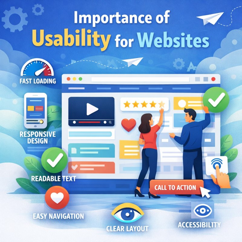
Importance of Usability for Websites
Usability has a direct impact on how users experience when using the website. The easier a site is to use and understand, the more comfortable and confident users will feel. This pleasant experience makes them want to stay and poke around some more.
Usability minimizes frustration and keeps users from dropping off the site because of confusion or complexity. It is critical to visitor satisfaction and Website success.
User-Friendly Design in Modern Web Standards
Current standards for the web reflect a mixture of user needs, technology, and device variation. User-friendly interfaces adhere to these norms and are consistent through efficiency, responsiveness, availability , and intelligibility. Other websites keep up to date with the latest usability principles, staying valid and successful in an ever-changing digital environment.
Understanding User Behavior Online
Creating a user-friendly website means understanding how users think, scan, and interact with the content online. Everything you do online is instantaneous and goal-driven.
How Users Navigate Websites
Readers usually don’t read word by word but scan the page. They depend on headers and layout structure—and visual cues—to help them find information fast. Clear logic and orderly material allow users to progress through the website without fear that they’ll trigger a flow break condition.
Expectations of Modern Website Visitors
Today’s visitors assume knowledge is at their fingertips. They like straightforward design that displays content clearly and without frills.
Sites that cater to these expectations feel streamlined and professional, while overly "look at me" designs turn you off.
Designing Based on User Intent
User-friendly design is all about the WHY people go to a site. Learning, contacting , or exploring, the design should lead in that direction. Lessen the redundancy and keep users on track with their goals by obtaining a cleaner design.
Website Structure and Layout
Structure and layout determine how easily users can understand and navigate a website. A strong foundation improves clarity and flow.
Organizing Content Clearly
Clear content structure for easy location of sections and information. It enhances comprehension and readability through logical groupings and visual separations.
Well-designed pages, after all, do feel more balanced and purposeful than they do cluttered.
Creating a Natural Page Flow
Page flow is natural and Navigates smoothly from section to conjecture. There should be a logical, intentional feel to content progression.
This strategy is user-friendly and doesn't confuse or inundate users.
Consistent Layout Across Pages
Consistency across pages creates familiarity. Users find navigation easier when presented with familiar layouts and patterns.
A consistent look instills confidence and adds to the professional image.
Navigation Design and Usability
Navigation is a core component of user-friendly design. It determines how efficiently users can explore a website.
1. Simple and Clear Navigation Menus
Navigation menus serve as the backbone of users’ experience when they visit a website. If the menu is simple and delineated clearly, then users will at once quickly know where they are and exactly how to get to the section they want. Simple wording eliminates guessing and enables your visitors to quickly make up their mind without having to think about it.
A clear menu structure will enhance accessibility by making it simpler for people with various browsing habits, styles, and skills to use the website. With fewer but organized options, they can think less about what to click, saving brainpower for thinking about your content and not your navigation.
2. Internal Navigation and Linking
In-site navigation is crucial to enable users in a natural way of browsing through websites. Linking similar pages and sections creates a seamless path that keeps visitors engaged without getting lost or discouraged. It pays to keep users around as long as possible, and facilitating easy transitions between related content offerings has a way of doing that.
A well-organized internal link layout promotes rationality and companionship on the website overall. Having a 'leading dude' is unobtrusive and intuitive – by continuing to click on this lead stuff, users wish to learn more about the information offered before their eyes.
3. Avoiding Navigation Overload
Navigation overload is what happens when a user has too many options at their disposal. Smorgasbord-type, extensive menus tend to confuse and hamper decision-making. Reducing menu options and emphasizing the most critical sections of a site greatly enhances usability.
Snappy navigation helps keep the interface tidy and purposeful. Visitors can easily see what options are available to them and decide with confidence, without fighting through the site.
Mobile-Friendly and Responsive Design
Mobile usability is essential as a large portion of users access websites through smartphones and tablets.
Importance of Mobile Usability
A good mobile experience is directly associated with engagement and satisfaction. A poor-performing website on mobile leads to friction and distrust. The smooth operation on any device allows users to function seamlessly.
Responsive Layout Design
Responsive design enables websites to automatically adjust to various screen sizes. layouts that reflow without becoming illegible or unusable. This is an option that makes everything even prettier, and it always looks great on any screen.
Mobile Interaction Elements
Mobile interaction needs touch-friendly buttons, legible text, and room to breathe. These features help prevent mistakes and improve roundness. Good mobile interactions support both ease of use and access.
Website Speed and Performance
Performance plays a critical role in usability. Speed affects how users perceive reliability and professionalism.
The Impact of Speed on User Experience
- Website load time has a significant impact on the impression of quality, reliability, and professionalism.
- It loads very fast and provides a reliable, responsive experience so that users can get to the information they want without links.
- Because they load quickly, pages are more likely to retain visitors as they navigate through them and interact with content.
- Slow or non-responsive sites frustrate users, disrupt browsing flow , and ultimately drive up bounce rates.
- They can also push even mildly inconvenienced users away, in competitive markets where alternatives are only a short finger-tap away.
- Performance has a significant impact on the user: * Top tasks have no value if they can't be accessed quickly.
Performance-Focused Design Choices
- Whichever way you look at it, performance-led design means that weight and speed come first – without sacrificing clarity of image or ease of use.
- Optimized images, minimized assets, and clean layouts mean faster times to show content.
- Eliminating extraneous things provides for quicker page build times and snappier interactivity.
- Lightweight designs let you optimize performance across regions, platforms, and networks.
- Sane design decisions mean that you don't have to sacrifice looks and performance.
Maintaining Consistent Performance
- As Simon brings to mind, consistency is just as crucial as mass velocity.
- Smooth and Predictable Reading Pages load at a predictable speed, helping to create an enjoyable reading experience.
- Reliable performance increases user trust and enhances the professionalism of your site.
- Easy to use, intuitive transitions and interactions. A product of good technical quality.
- A fast, not jerky website encourages more exploration and further reading from return visitors.
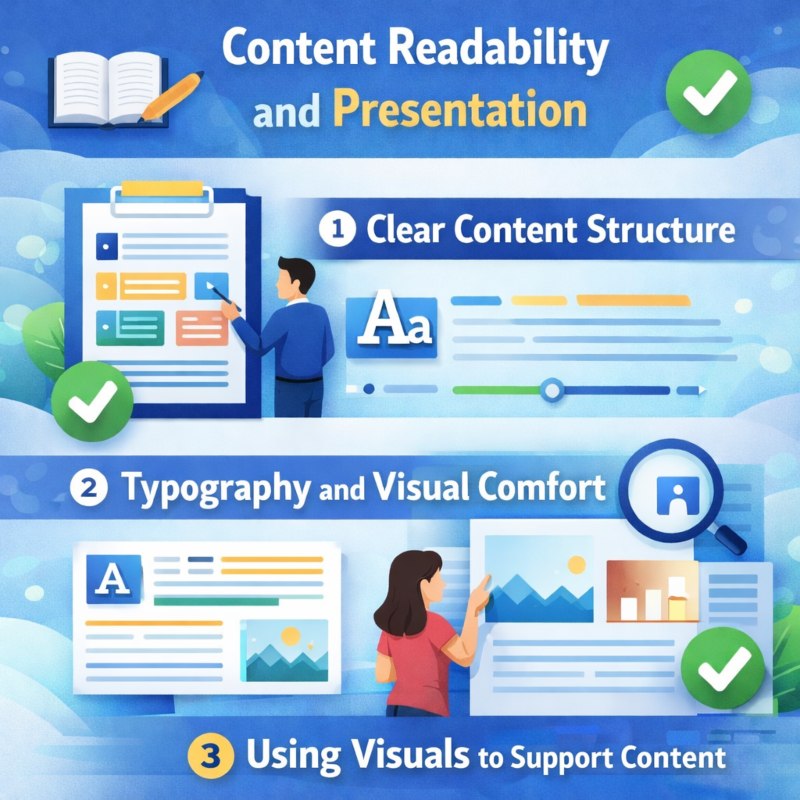
Content Readability and Presentation
Content must be easy to read and visually comfortable to support usability.
1. Clear Content Structure
Respond with smart content structure. Paragraphs are short, and headings are descriptive, guiding readers naturally down the page as they scan, comprehend, and engage all of the elements on a page.
2. Typography and Visual Comfort
Carefully selected typefaces, ample space, and suitable positioning reduce eye strain, enhance reading pace, and enable users to remain focused and comfortable for extended periods.
3. Using Visuals to Support Content
Appropriate Visuals-illustrations, photos, charts- all can be invaluable in complementing your point or idea. Make sure to use them as a complement at powerpoints, because too many visuals clutter the message or dilute it by obscuring what's important - when less is more, and that applies here as well.
Accessibility and Inclusive Design
User-friendly design considers the needs of all users.
Designing for All Users
Designing for all users involves developing websites that cater to various abilities, habits, and ways of accessing digital content. Frankentweaking is designed to be functional for people and devices with limitations that can stand in the way of everyone easily navigating, reading, and working on a website. These considerations enhance the experience for everyone and build an inclusive, successful digital ecosystem.
Basic Accessibility Practices
Fundamental principles of accessibility. Good communication and interaction. Accessibility, at its simplest, is good communication. It’s that which also makes color contrast good to increase visibility, readable text to consume information comfortably, and a clear layout for intuitively grasping content structure. Such measures are not only the mark of a professional, responsible designer; These practices ensure that sites are useful to all users.
Benefits of Inclusive Design
Inclusive design increases the audience of a website by increasing accessibility. It just makes everything better; it builds trust and naturally shows insight into who is using your platform. That way, it builds brand perception and long-term digital success.
Trust and Credibility Through Design
Design influences how trustworthy a website feels.
Consistent Visual Identity
Brand consistency is one of the best ways to create a strong, professional, and memorable presence online. Users start to become more familiar with your brand as they see the same colors, fonts, and website elements used similarly on your site — both layout-wise and for other design elements. This sense of clear, organized feeling builds trust and extends the brand itself.
Clear and Honest Information
Judicious and truthful information enables persons to spot what they look for without confusion or doubts. The easier it is to find and understand content, the more relaxed users will feel navigating your site. Transparent communication via design and content helps build trust, inspiring meaningful interaction.
Visual Signals of Reliability
Noticeable cues such as clean design, proper spacing, and good organization of information signal stability and trustworthiness. If a site is well-organized, it leads to the perception that thought was put into its structure and user interface - especially if there's an obvious information architecture at work - which helps create confidence in the quality of both the site and source as trustworthy.
User-Friendly Design That Supports Conversions
Usability directly supports meaningful actions.
Clear User Guidance
Intuitive user cues mean visitors always know where else to go - with no baffling or guesswork. Clear logic, action points , and cues guide users through the website fluently. Guidance that feels intuitive will enable users to be more supported, more confident, and move forward with a greater desire to engage in the website.
Reducing Friction in Interactions
The lower the friction, the fewer unnecessary steps that will slow down or call into question users. Straightforward forms, minimal mandatory fields, and clear calls-to-action help make tasks more achievable. And when conversations flow more naturally, users are more likely to complete them, resulting in a better experience and higher completion rates.
Maintaining Balance Between Design and Function
The right balance between design and practicality will ensure that the website looks good, even without highly attractive graphics. Design should aid in using, not get in the way of. A well-balanced website doesn’t rely unreasonably on effects, but focuses on clarity and performance and achieving user goals rather than relying on visual razzle-dazzle.
The Role of Professional Web Design Services
Professional services bring experience and long-term vision.
Experience-Based Design Decisions
The decision is based on years of experience and working on diverse projects in various industries and scenarios with different types of users. Good design is about how websites work, not just having them look good. Experienced designers know that the user experience with a website begins well before the user actually navigates there. Usability testing, performance analysis, and user observations are the basis of their decisions. It's this kind of practical, hard-won knowledge that helps them to understand issues before they arise and develop solutions that seem intuitive and trustworthy. The consequence is that websites produce more consistent results, using smoother user experiences while avoiding some of the usability problems of novice designs.
Continuous Improvement and Updates
Ease of use is not a one-time design goal; it’s a never-ending process. Just as in retail, what worked online for the websites of yesterday may not work today. Thus, websites are evolving to fit modern user behaviour, technology, and expectations. These updates are released to improve the function of existing scripts, make the users more responsive, and address any new user requirements. In other words, good (evolving) design Elements and Layouts remain timeless and practical. By monitoring user feedback and performance data, designers have more control over the website than ever before and can make better-informed decisions about what adjustments need to be made in order for the site to reach its targets of sustained engagement with long-term effect.
Long-Term Website Quality
Building for the long term: there's no shortcut to a quality website, and it will only be as enduring as your design systems. Carefully planned styles, efficient code, and scalable systems are easy to use to accommodate a growing amount of content simply by adding components or options. This minimizes the frequent redesigns or significant modifications. By focusing on the long-term quality, you can achieve a better performance, less maintenance, and consistency towards what is left to maintain. Websites built to last also enable you to scale gradually, ensure user reliability on your platform, and maintain value over time.
Frequently Asked Questions (FAQs)
User-friendly website design is also about designing a website that users can understand, navigate easily, and use comfortably on various devices. It helps visitors discover information fast, do what they need to do in one go, and interact with the site easily—without guidance or head-scratching.
Conclusion: Why User-Friendly Website Design Matters
Easy-to-use website design is a critical factor in the way your users perceive your brand online. A well-designed site that is easy to navigate, visually uncluttered, and logically laid out balances anxiety with a sense of comfort from the first moment a user lands on it. Such clarity serves to increase satisfaction while visiting your site and keep visitors centered on why they're there, content, message, and what value you bring, without having to battle the site itself.
Usability-Driven Websites entice users to dig deeper by leading them intuitively through information and actions. Smart organizations, well-structured conversations, and reliable performance increase trust and credibility over time. They are more likely to come back, delve deeper, and generate good vibes around a brand that knows how to respect time and listening.
For businesses seeking a website that balances design, performance, and usability, The WebDesign offers a strategic, experience-driven approach to web design and development. Connect with The Web Design to build a user-friendly website that supports your goals and delivers lasting results.
Search
Categories
Recent Posts
-

20 Dec, 2024 Building Brand Loyalty: How Custom Mobile Apps Drive Business Success
-

17 Jan, 2025 Designing An Attractive and Truly User-Friendly Website!
-

23 Dec, 2024 Driving Sales Through Online Channels: Transforming Your Business with a Webshop
-

09 Sep, 2024 Enhancing Customer Engagement: The Business Benefits of Mobile App Development
-

23 Dec, 2024 Expanding Market Reach: The Strategic Value of an E-commerce Webshop
-

10 Mar, 2026 Google Review Card: NFC vs QR – What Works Better?
-

09 Sep, 2024 Harnessing Professional Web Design: Elevating Your Business’s Online Presence
-

09 Sep, 2024 How an Online Delivery System Empowers Business Operations
-

20 Jan, 2025 How To Build A Custom Website For Your Business?
-

20 Jan, 2025 How To Create A Professional Website For Building Online Presence?
-

02 Aug, 2024 How to Plan a Perfect Digital Market
-

23 Dec, 2024 Investing in Website Development: Enhancing Customer Engagement and Conversion Rates
-

23 Dec, 2024 Meeting Customer Expectations: The Competitive Edge of an Online Delivery System
-

23 Dec, 2024 Optimizing Logistics: Enhancing Business Agility with an Online Delivery System
-

17 Jan, 2025 Optimizing Your Website with a Website Builder in Amsterdam
-

03 Apr, 2026 The 10 Biggest Mistakes When Building a Website – and How to Avoid Them
-

27 Dec, 2025 The Cost of Getting a Website Made: What You Can Expect in the Netherlands?
-

09 Sep, 2024 The Essential Role of Online Marketing for Businesses
-

20 Dec, 2024 The Power of Digital Storytelling: Leveraging Online Marketing to Connect with Customers
-

23 Dec, 2024 The Strategic Advantage of a Well-Designed Website for Business Growth
-

23 Dec, 2024 Unlocking Market Potential: How Strategic Digital Marketing Propels Business Success
-

09 Sep, 2024 Unlocking Revenue Streams: Establishing an Online Webshop for Your Business
-

27 Mar, 2026 What is sitemap.xml and Why Is It Important for SEO?

15 Jan, 2026 What Makes a Website Design User-Friendly?
-

21 Mar, 2026 What’s Involved in Having a Website Created: A Step – by – Step Guide
-

27 Feb, 2026 What’s Involved in Having a Website Created: A Step-by-Step Guide
-

21 Jan, 2025 Why Consider WordPress for Website Builder?
-

21 Jan, 2025 Why Do Businesses Hire WordPress Website Builder Companies?
-

20 Jan, 2025 Why Does Your Business Need a Local Web Design Agency?
-

11 Dec, 2025 Why You Should Have a Professional Website Built in 2026: What’s Changing?


